LOUIS HOUSE,
PORTLAND
A CASE STUDY
UWORLD
webpage redesign

A rapid redesign with very limited context or shared data to test assumptions about the current design
Role: UX / UI design and research lead
Timeline: 2 days - Quick exercise
Tools used: Sketch, Illustrator, Photoshop
I was tasked with taking one page from a full website and determining any changes to be made. At first look, it seemed that this page was perfectly acceptable and rather attractive looking. But after further analysis I was able to make some significant changes.
I was only allowed limited direction and had to do my own research, and quickly, and make assumptions based on the data I found. Here is my journey and the results.
EXPLANATION
Any website is not simply one page and cannot be approached from a single page design perspective. Therefore, the entire site must be considered when starting any design from scratch. Context is key to developing a proper design for any product. Since this is a test and I do not have access to critical user and stakeholder data, I have chosen to use the User-Centered design approach and make several assumptions based on common knowledge and online research I am able to conduct rapidly on my own.
CONTEXT OF USE (ASSUMPTIONS)
Based on rapidly accumulated online research the following statistics were generated:
-
Typical student age range for a taking the MCAT is between 24-to-30 years of age. General age for entry into a Nursing program is between 30 and 35 years of age. The median age for male RNs licensed in 2000 or later is 35, compared with 31 for female RNs.
-
2 million (91 percent) nurses are female, only 330,000 (9 percent) are male. Men are best represented among nurse anesthetists. In 2011, 41 percent of nurse anesthetists are male.
-
Total US Nursing Population: 2,824,641 Registered Nurses (RNs) in the US, 690,038 Licensed Practical Nurses (LPNs) in
the US
-
How do minority nurses self-identify? 9.9% of RNs are black or African American (non-Hispanic); 8.3% are Asian; 4.8% are Hispanic or Latino; 1.3% categorize themselves as two or more race; 0.4% are American Indian or Alaskan Native. With the largest percentage being white.
-
Education – Highest level of nurses are reported to have a bachelor’s degree, followed closely by those with an
Associate degree.
PERSONAS
Persona Scenario 1
Terri intends to go into nursing and become an RN after completing her Bachelor of Science in Nursing. She is searching online for the best option for them to take the MCAT to get licensed and has located the UWorld site from a Google search. Passing the NCLEX-RN is their next logical step in her education, and making the right decision around where to study for it is critical in her not wasting any time, or money.
Persona Scenario 2
Jessica has completed their basic studies and received an Associates of Science in Nursing degree but does not intend on completing a bachelor’s degree and wants to go straight for her nursing license as a PN and has discovered that they can get it without a 4-year degree. She is searching online for an affordable option that will properly prepare them for the MCAT. Passing the NCLEX-PN is her next logical step. She heard about UWorld.com from another classmate and has decided to visit the site to see what options they offer.
SPECIFY REQUIREMENTS (PROVIDED BY UWORLD)
Please redesign our MCAT product microsite, given the following parameters: 1) it must be long-scrolling, and 2) it must include all the information that the current site has. You may use any design tools of your choice (Sketch, Axure, InVision etc).
HINT: We prefer a more business-focused, professional look.
ADDITIONAL ASSUMPTIONS
-
Not knowing whether the 15-Day Free Access pass was A/B tested, I have opted to relocate it under Pricing, in order to declutter
the page.
-
As a user enters the page the Overview Video gives a quick sales marketing push, that should be featured first, followed by a demo of the product, appropriately located under features and benefits.
-
User Interface – Tertiary menu: Features a title telling users where they are on the site, and anchor points that allow users to jump between sections of the page with a fixed menu.
-
Contact Us – placed at the top as well as the bottom for easy access.
-
Pricing is more appropriate term than “Buy”, buy implies that there is only one purchase option. Pricing has been moved to the tertiary menu as it is more appropriate on the page section level. As pricing per product should be affixed in the titled tertiary menu.
-
Photos have been changed to follow the determinations of the primary target market. Users are featured in appropriate age and race ranges and are featured as enjoying the use of the product and the benefits of passing the MCAT.
Final Thoughts
A clean, concise website layout tells the story of a simplified and perfected product. Access to features that allow users to problem solve using the “Help” feature should be followed by a secondary action of “Contact Us” for support related issues.
UCD EVALUATION PROCESS
(1) Specify the Context of Use: Identify the people who will use the product, what they will use it for, and under what conditions they will use it.
Answer: As noted above – The highest percentage of market is a White Female, between the ages of 30 to 35 Years of Age, with a level of education of an Associate Degree or Bachelors. The conditions are mandated by the product – an online education tool. Additionally, a survey states that the notes taking capability of laptops are preferred to tablets in traditional college prep usage. Therefore, only when introducing the UWorld App will tablets be featured in a photo.
(2) Specify Requirements: Identify any business requirements or user goals that must be met for the product to be successful.
Answer: As directed above – Make the product (page) function more efficiently, while also marketing to the appropriate target audience. Addition of tertiary menu with anchor tags.
(3) Create Design Solutions:This part of the process may be done in stages, building from a rough concept to a complete design.
Answer: Prioritize the highest value of content that delivers the greatest value. Concise explanation of how the product performs, delivery method and success model. Reduce visual clutter.
(4) Evaluate Designs:Evaluation – ideally through usability testing with actual users – is as integral as quality testing is to good
software development.
Answer: Due to the lack of availability to user content, assumptions will be made utilizing statistical data (provided) and best practices. These will be applied to the media selections including: Content placement (order), selection of imagery, iconography and the simplification of the design, in order to concisely present the highest value with the lowest amount of overall content.
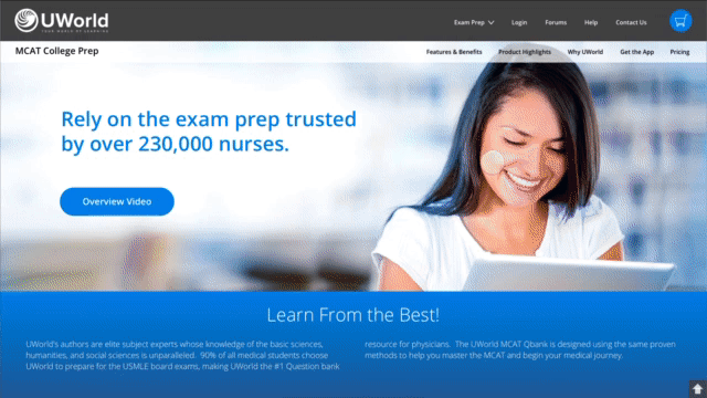
ORIGINAL PAGE DESIGN


UX DESIGN REFRESH


Home Page - Standard (1440px)

(4) The Large (bouncing) Arrow – is both distracting and an overly amplified version of what is needed. By shortening the hero and allowing the user to get a glimpse on content below the “fold” should be enough, an addition of a simplified down arrow is enough for a typical user to understand.
(1) Primary (Main) Menu – A Hamburger icon, should only appear once a web page has reached the appropriate breakpoint for mobile devices. Contact Us, should appear at the top and bottom of the page as it is useful for users to access when they are looking for additional support. The “Buy” button, implies that there is only one purchase option for the software product.
(2) Tertiary Menu (added) – The page title is affixed to the menu so that a user always knows where they are on the site. Tertiary links are set to anchored breakpoints, within a fixed menu, so that users can quickly jump to sections rather than scrolling (a chief complaint of most users). The addition of a “Pricing” link has been added to allow the user to jump to the pricing section and is consistent with the tertiary link action.
(3) The Hero – the image has been updated to represent the highest/greatest target market of a white female in her early to mid-thirties. The headline “Master the MCAT Perform your best” has been removed in favor of a positive marketing statement specific to the product. The View Demo button, feels premature, and is offered before the user can make an accurate assessment of the product. The product video featured further down the page is more appropriate for this location. The yellow badge offering “Free Access” has been removed, as it clutters the page, is distracting and seems premature. Again, the user has not had enough time to learn about the product. Any user wishing to return and go directly to purchasing and take advantage of the Free promotion, may do so via the tertiary menu.

(5) Key Features – has been combined with “Innovative Answer Explanations” and renamed, “Features & Benefits”. “One of a Kind Explanations” shares similar content with “Innovative…” and due to the video being moved to the hero, and the desire to compress the page, while still offering the same content, I’ve combined the two sections. This section has also been converted into a rotating carousel to minimize the amount of initial visual load on the page.
(6) View Demo – I’ve moved this button to a fixed location at the bottom of the Features and Benefits section and will be visible, on every frame of the carousel.

(7) MCAT QBank Highlights – features the same content but fixed the alignment issues between boxes and simply used Microsoft streamlined icons (with minor variations).

(8) UWorld App – I’ve chosen to break this out, as it seems lost (almost hidden) in the former “Key Features” section of the site. I’ve also added a direct link into the tertiary menu for quick access, as a user may go back to this at a later date – during their study/training phase. I deliberately placed it visually at a different point in the page than it is ordered in the tertiary menu. Although the tertiary ordering seems most appropriate, variating the placement on the page allows for a much-needed visual break between the “Highlights” and “Why Choose Us” sections of the page.

(9) Why Choose Us? – Again, I merged two of the items in this list, “Know You Are Ready For The MCAT” and “Just Like The MCAT”, as the content is very similar. Additionally, I removed the ALL-CAPS for best readability practices, and lengthened many of the descriptions to be of similar length (to match the longest). I also, opted to create a more compelling image that shared multiple screens in one photo.

(10) Customer Quotes – Former Students. Attribution is everything. Quotes without direct attribution feel disingenuine and are seen as potential fabrications. Adding names and titles, especially related to the field associated with the test, builds confidence with the user, and showing the former user in their field of practice draws a picture of possibility for users.

(11) Pricing – This is fairly straight forward, I added a header over the Free version, to highlight it more. I’ve changed the title color of this section to black to be more consistent with the other sections, but also to emphasis the hyperlinks and avoid confusion with the user who may believe that they are all active or inactive links. I also added a header to the last pricing option to highlight that it is the greatest value, price per day. Additionally, I rearranged the content within the pricing blocks to highlight the greatest benefit, which is the true value, not the price.

(12) The Footer – I saw no evidence to support the breaks between legal product lines and centering the legal copy. I also reduced the importance of the lower links, as they are subservient to primary links above in the fixed menu.
(13) A “Return to Top” Arrow – has been added to the lower right of the page to allow the user to quickly return to the main menu.
PROTOTYPE