LOUIS HOUSE,
PORTLAND
A CASE STUDY
FINAGLE IT
MOBILE APP DESIGN

A ground up application concept-through-user experience and interface, created and tested using human-centered design
Role: UX / UI design and research lead
Timeline: Informal exercise taken from
a class project
Tools used: Axure, Illustrator, Photoshop
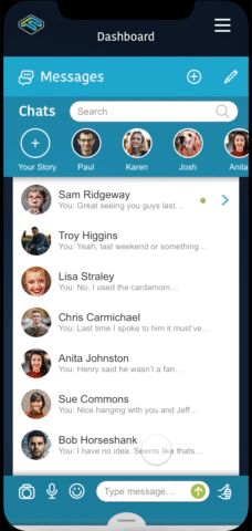
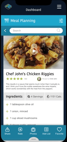
FinagleIt is a self-learning mobile application concept, that behaves like a personal assistant for busy people that have a daily list of objectives, from personal to professional. The app features daily meal planning, offering recommendations based on the user’s input and routines. It also offers recipes, creates lists, plans trips, allows users to message and share with other members, all while integrating with popular calendars (like Google) to save setup time.
PROJECT PROCESS
Although this project was not a linear process, for the sake of presenting this case study in logical parts, I’ve broken down the experience/interface process into five primary phases, with a sixth added for branding.

RESEARCH
With limited data due to a lack of access to customers (being that this was an untested new product concept), data was created based on competitive analysis of similar applications and their reviews. A study of 200 users in two similar market segments was researched and data gathered to develop the following statistics. Additionally other research into color theory and marketing development was captured to create the application’s brand/identity.
The research gathering models included:
-
Competitive Review Data Analysis
-
Competitive Site Analysis
-
Problem/Solution Statement
-
Personas
-
Color Theory

Competitive Review Data Analysis
Due to a lack of direct contact with product users (as this was a new product concept), the closest I believed, was to see what our competitor’s users were saying about similar products. Data sourced and culled included pain points directed toward major changes in the existing interface behaviors and navigation. Users viewed major changes to the interaction model behavior as negative, creating the need to relearn the interaction.
Still other data pointed to making the flow between user and application more seamless. Positive behaviors that acted to remind the users, while requiring less input from the them.
Competitive App/Site Analysis
A study of two competitive sites emerged from a filtered search process. One, primarily a robust calendar app, lacked the integration of meal planning and social sharing… Another, lacked the robust features associated with the calendar app.
FinagleIt was the culmination of both apps and more.

.png)
Problem/Solution Statement
The Challenge: Market research revealed that there are many apps that handle one, or even two of the behaviors/functionality tasks found within FinagleIt, and some are more robust within those specific app categories. None performed all of the primary functions of FinagleIt and none work in an integrated way to allow all functions to communicate with one another and share those socially.
The Approach/Solution: The concept deliverable was creating a comprehensive system that manages common daily tasks and events while also learning, based on user preferences, voting and daily activity, sending users daily reminders/recommendations.
Giving users an app that truly thinks ahead, planning in advance and taking much of the daily guesswork out of the equation to free users from the monotony of creating daily management models, while moving data into calendars and sharing events and recipes socially.
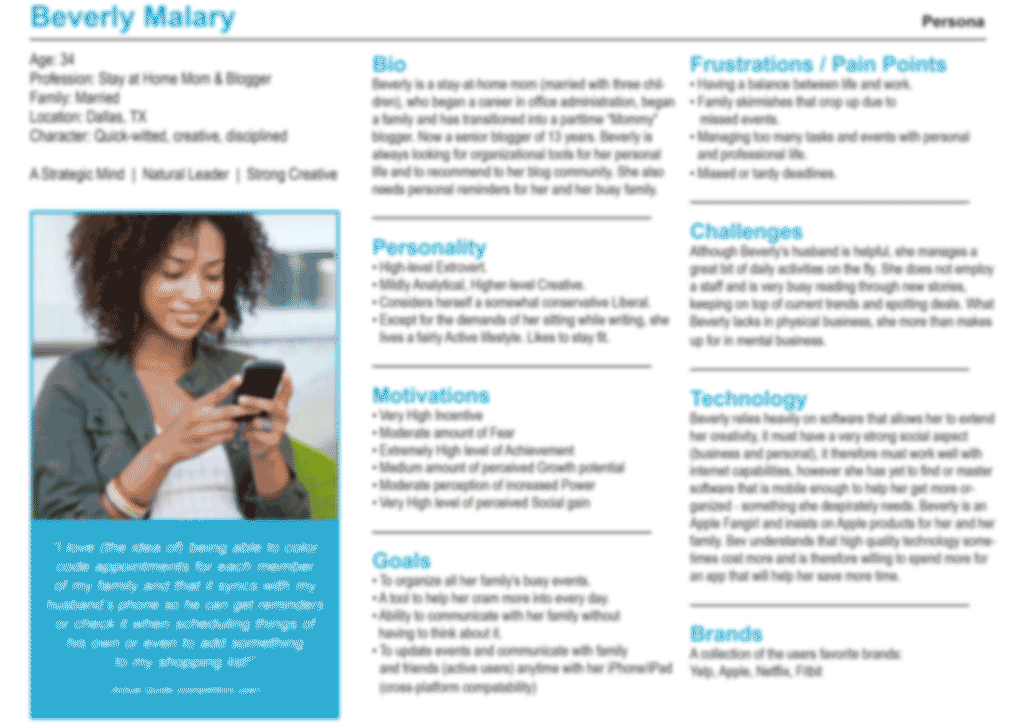
Personas
The creation of user personas allowed specific user profiles to be created to help define the various user behaviors and habits, pain points and frustrations and help design a better experience. Unique personas helped to understand users’ needs, experiences and goals.
The personas added context to help develop appropriate tools to meet our most common user’s needs (based on research). Building personas lead to better design experiences for basic tasks, guided the ideation processes, and helped to achieve the goal of creating a good user experience for the target user’s types.

*Color Theory For Designers, Part 1: The Meaning of Color, by Cameron Chapman, January 28th, 2010
Color Theory
Limited research based on analysis of user preferences. A study of 200 users in two similar market segments was researched and data gathered to develop the following statistics:
Blue is used extensively to represent calmness and responsibility. Light blues can be seen as refreshing and friendly. Dark blues show strength and reliability. Blue is also associated with peace and has spiritual and religious connotations in many cultures and traditions.*
Green is a very down-to-earth color. It can represent new beginnings and growth. Green has many of the same calming attitudes that blue has, while also incorporating the energy of yellow. In design, green can have a balancing and harmonizing effect on viewers. It is appropriate for designs related to wealth, stability, renewal and nature.
.
DATA DEVELOPMENT
Looking at the data some trends and inspirations began to emerge. Behaviors like the ability to share meals with other users via photos, chats and recipe share. The ability to capture minimal data from travel sites and add events automatically to calendars, as the event is booked.
Remind users that the weather has changed rapidly and make recommendations on clothing. Integrating with Google maps to help users get to a scheduled destination on time, and send alerts based on weather and traffic interruptions. Rating recipes with a users FinagleIt community and vote recipes up or down, as well as simple actions, like telling users when their favorite shows are coming on.
FLOWS
Through the research development (fed via competitive analysis) I built, refined and augmented the flow structure, making sense of linking behaviors.

WIREFRAMES

BRAND
Crafting of brand elements & composition of app style
The logo visually speaks to the difficulties of life and ideas of having extremely busy days where a user’s need scheduling help from an assistant that can be flexible. It also speaks to how the app adjusts and conforms to keep pace with the user’s complex and active personal and business lifestyles.

finagle
or fenagle
[fi-ney-guh l]
Examples Word Origin
verb (used with object), finagled, finagling.
-
(transitive) to get or achieve by trickery, craftiness, or persuasion; wangle
-
to get or achieve (something) by guile, trickery or manipulation

COMPS


PROTOTYPE