LOUIS HOUSE,
PORTLAND
A CASE STUDY
AT&T
Partner exchange website portal

Complete redesign of AT&T's Partner Exchange website portal, both authenticated and unauthenticated versions and the tools and techniques used to create it
Role: Senior UX / UI design and research tertiary
Timeline: Iterative, over 10 months (5 Sprints),
then ongoing
Tools used: Axure, Illustrator, Photoshop
Tools used: Sketch, Protopie, Zeplin, Illustrator, Photoshop
The AT&T Partner Exchange is a business and application-based website that allows resellers in their channel to sell AT&T products and services to their customers. The business is focused on increasing sales within its current customer base, while also recruiting new Service Providers through their web portal. Users can build an entire suite of products or, fill gaps within their existing product offering. As lead UI designer and member of the UX team, I specialized in design and research from end-to-end, incorporating user-centered design, based on feedback through multiple UX practices and interviews, with internal stakeholders and users.
PROJECT PROCESS
Although this project was not a linear process, for the sake of presenting this case study in logical parts, I’ve broken down our experience/interface process into five primary phases.

RESEARCH
We began the research phase of the project internally, using human-centered design practices and scheduling interviews with local stakeholders, including team leads, directors and managers in sales, marketing, product and strategic reach to develop a baseline for what staff members saw as obvious hurdles and shortcomings within their current site model, as well as any glaring issues with the current interface
The research gathering models included:
-
Stakeholder Interviews
-
User Interviews
-
Field Studies
-
Competitive Site Analysis
-
Mood Boards
-
Personas
-
Card Sorts

Stakeholder Interviews
The Challenge: The UX team sat in multiple interviews with team leads, managers and directors to determine that many issues users had stemmed from technical (development issues). However, the highest priorities, distilled from actively listening, revealed that we both needed to increase sales with current SP’s (Service Provider’s) and develop new SP’s through AT&T’s intensive on-boarding process. The challenge was that there wasn’t the bandwidth to support these goals.
The Solution: We discovered that what was needed was a tool that both, shared greater knowledge of program offerings and requirements with potential SP’s (including an online pre-qualifier), to minimize much of the heavy lifting Strategic Reach would manually perform with each service provider.
User Interviews
After meeting with our stakeholders and notating and tabulating their results to find patterns, we turned our sights towards our users.
We began with phone interviews and problem solved ideas with them in Mural, then invited users in and interviewed them in-house. Additionally, we looked through a series of videos from our channel events, to pull insights from.

Field Studies
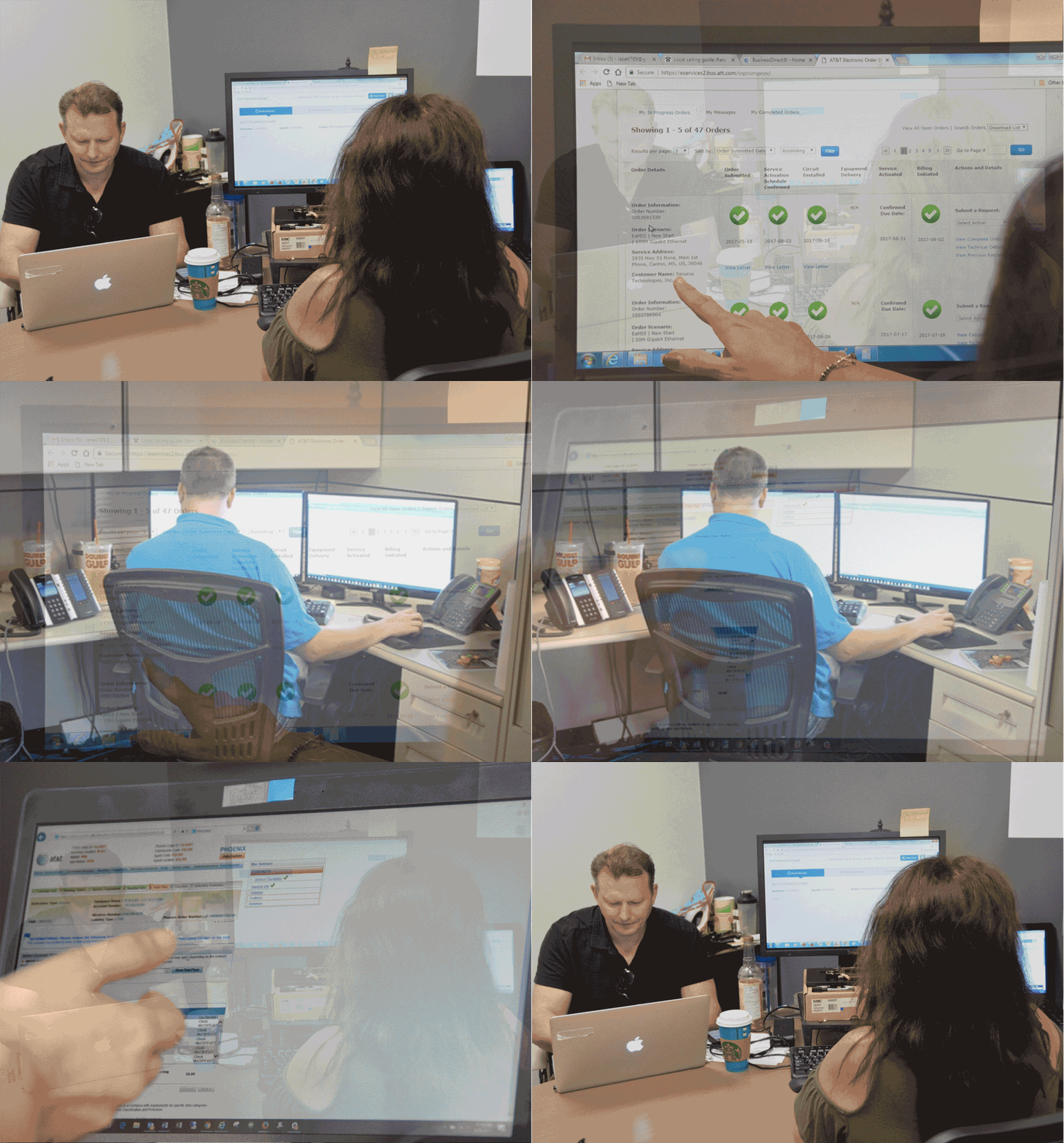
Visiting multiple client locations, we sat with our users and went through any frustrations on the screen with them, then heard both about what they really thought was innovative and enjoyed, as well as new ideas for better experiences.
We shared this project with our CX team, all comparing notes and refining results. We then filtered those findings to help define patterns and develop improvements for the future portal, as well as push ones for the current one.
Competitive Site Analysis
During the process of interviews we discovered our closest competitors and learned from their successes through page-by-page analysis, determining assets and short-comings. Molding the positive attributes into something more suited for our users and using that as the starting point.
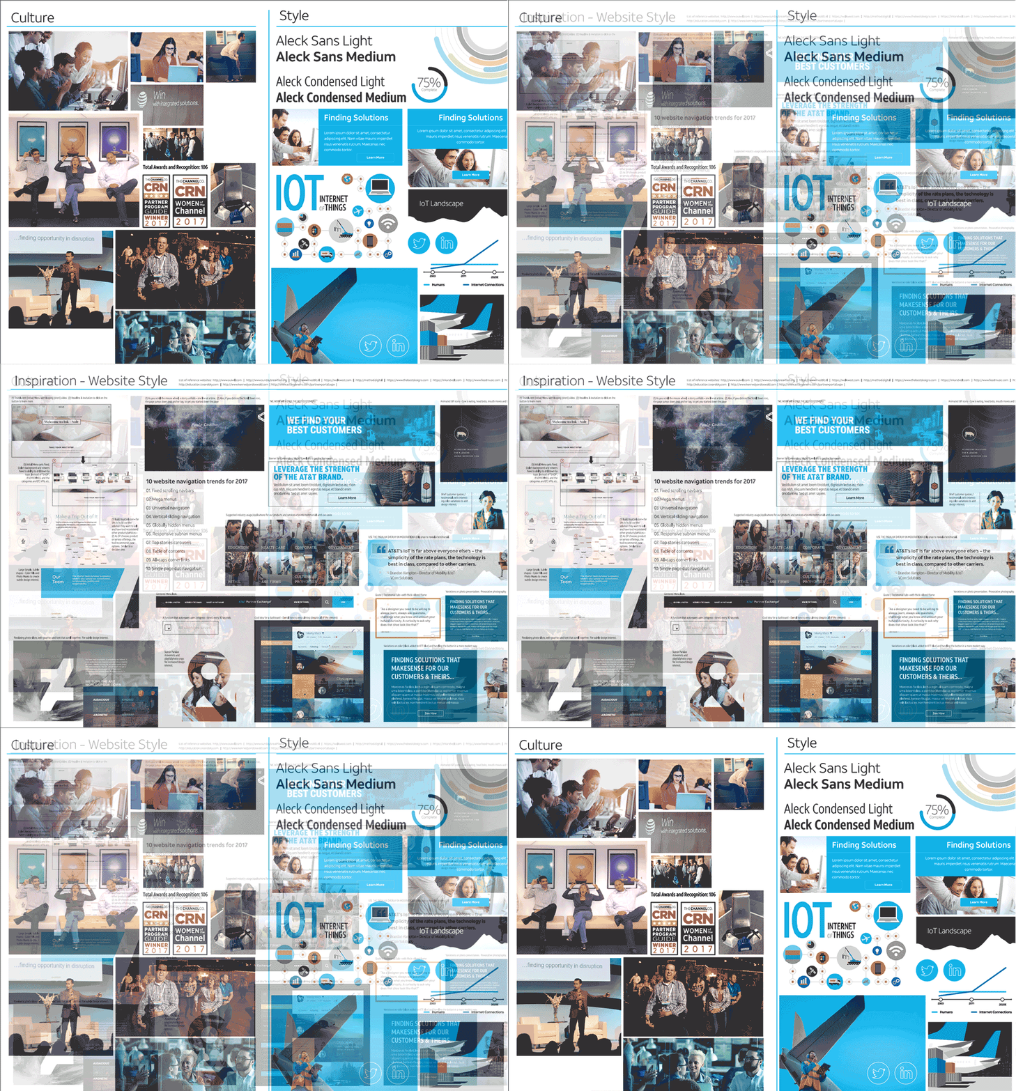
We also developed several style boards with participation from the design and development teams, and match-ups with similar content that aligned with AT&T.
The team gathered findings in Excel docs, Illustrator and
on Mural.

Mood & Style Boards
Mood and style boards do more than illustrate the obvious, they give form to ideas through metaphoric iconography, imagery and color, to build a narrative a strategy and a framework from which to build.
Creating a composition with an arrangement of images, materials, text, colors and visuals intended to evoke a particular style is no small feet. We gathered much of the culture through trophies, event photos, whimsy of our surroundings and capturing camaraderie between Strategic Reach, Sales and our Service Provider’s. Additional culture cues were pulled from marketing’s vision, corporate branding, the vision of senior members, the goals of corporate and much more.
Personas
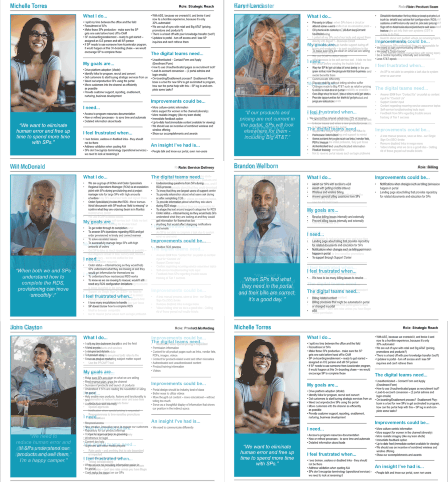
Personas are fictional characters, created based on research in order to represent the different user types that might use AT&T’s products, and web portal to complete purchase orders and fulfill contract needs. Creating personas helped us to better understand our users’ needs, experiences, behaviors, goals and expectations. Ultimately, it allowed us to craft our content and tools to meet the needs of our district user types.
Building personas lead us to design better experiences for basic tasks, guide the ideation processes, and helped us to achieve the goal of creating a good user experience for your target users types.
Card Sorts
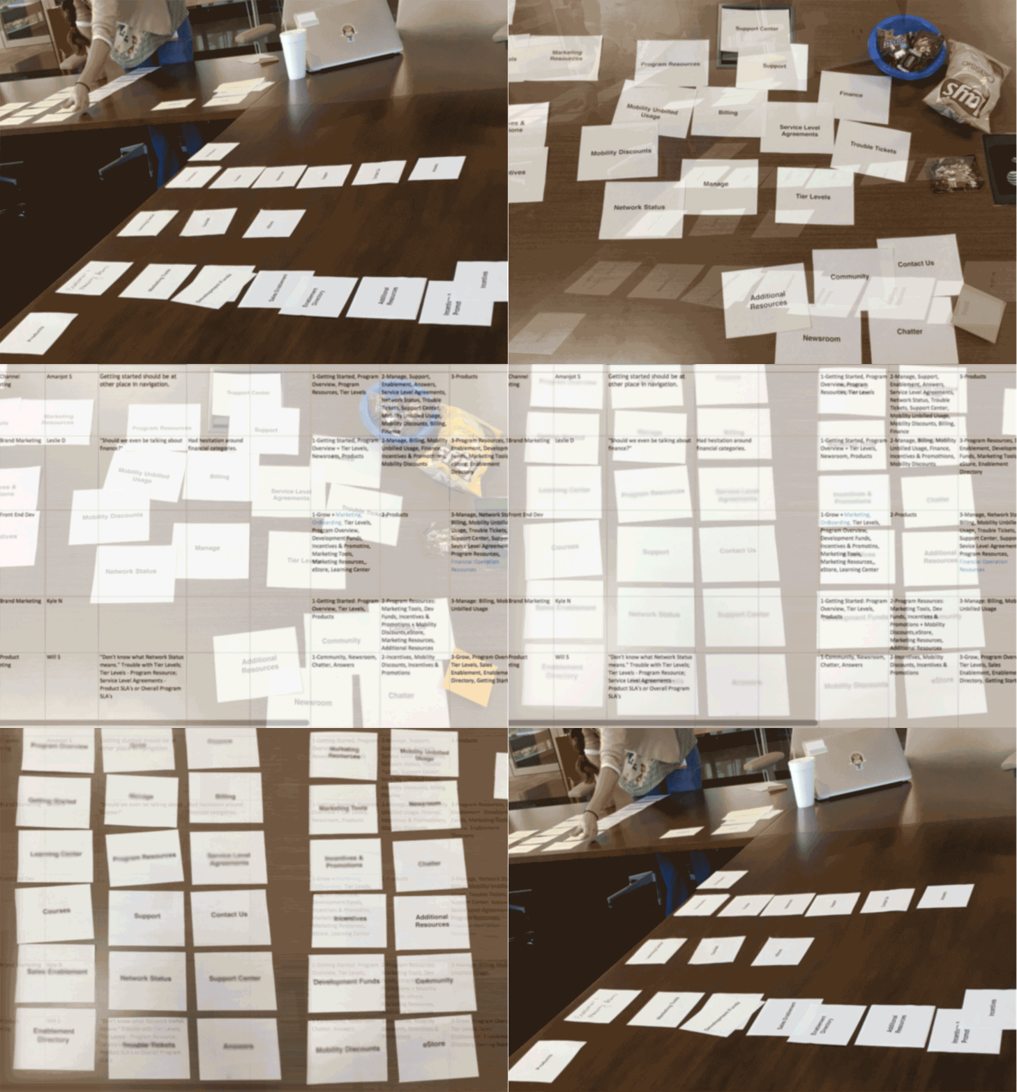
We used card sorting to help design or evaluate the information architecture of a site. In the card sorting sessions, we met with both stakeholders and users (independently) and asked the participants to organize topics into categories that made sense to them, as well as, create or delete topics they felt were missing or redundant. We conducted card sorts using actual cards, preprinted and cut from pieces of paper, we also used Mural with some of our offsite stakeholders in other Cities/States.
We used the data from these card sorts to rename and rework the current website structure and naming conventions. Some users found terms only made sense to internal AT&T staff and not to them. Others helped redefine placement of current sections into more definable categories.
DATA DEVELOPMENT
Developing the data required speaking with several people, from business owners, marketing and sales directors and provisioning directors to customer experience, on-boarding, product design and more. Recording their output in multiple forms, re-reading, re-watching and re-listening to that content and culling pain points and insights, that were worked into a distilled data matrix. From that we built set behaviors, directions and flows.
This came about through an urgency, requiring collaboration from every department within the Partner Exchange, learning from other business units, listening in on sales calls, trouble ticket calls, speaking directly with new and more senior Service Provider’s and sifting data from current materials. We invited SP’s to the Partner Exchange and we visited with users in the field, with the primary motivation of deliberately putting ourselves in situations that forced us to notice subtle details that would have normally gone unnoticed.
This gave way to new ideas for interactive tools, that were met with the challenge of software limitations (based on the existing Salesforce platform) and eventually gave way to the creation of the “best we could do” approach, to help new users experience higher tech experiences through a lower tech capable platform.
Finally, we created our segmented user models and built the new site to meet their specific needs, truly allowing form to follow function.
Results:
Anecdotal evidence shows that Service Provider's like it much better than the former version. It is truly a tool they can use now... and instincts about putting "Support" in the primary menu was dead on. Management decided to remove it before launch and then have it appear in a later Sprint, but SP's complained, asking for it in the initial launch. So it was added back in.
Another proof of concept is that every other reseller business unit -ACC, Alliance and Wholesale now want the same website experience. They are able to integrate, due to our initial instinct to pre-plan for additional channel growth. Alliance, one of the largest, oldest and most complex factions of AT&T is already poised to use our portal design.
Another discovery, bearing fruit is one we made, for presenting all product and service data to the masses, instead of hiding it behind a wall. Allowing users to see this content within the site, retains users in greater numbers and keeps them on site for partner conversion, a sub-set goal of The Partner Exchange.
FLOWS
Through research development, assisted by card sorting, the team refined and augmented the current flow structure, as well as made it more understandable for service providers.


WIREFRAMES
Home Page – Breakpoints @ 1440, 1024, 768, 375px

The Program Page – Breakpoints @ 1440, 1024, 768, 375px

The Program Page – Breakpoints @ 1440, 1024, 768, 375px

PROTOTYPES
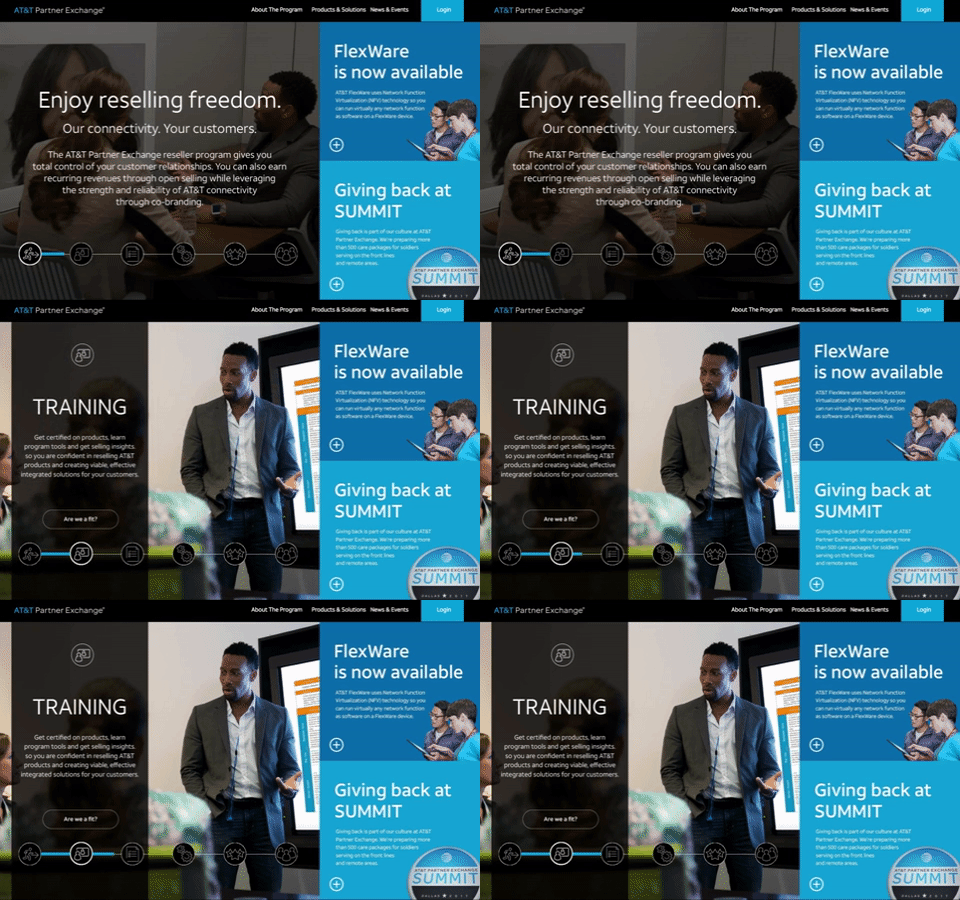
Home Page – Desktop (1440px)
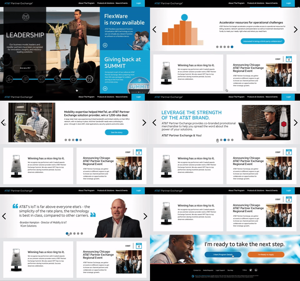
Home Page – Mobile (375px)

Product Page – Tablet (768px)
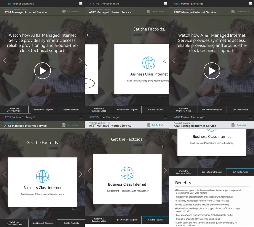

Product Page – Desktop (1440px)
